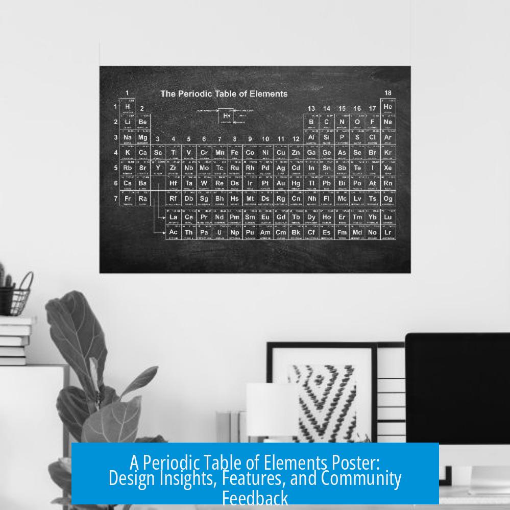
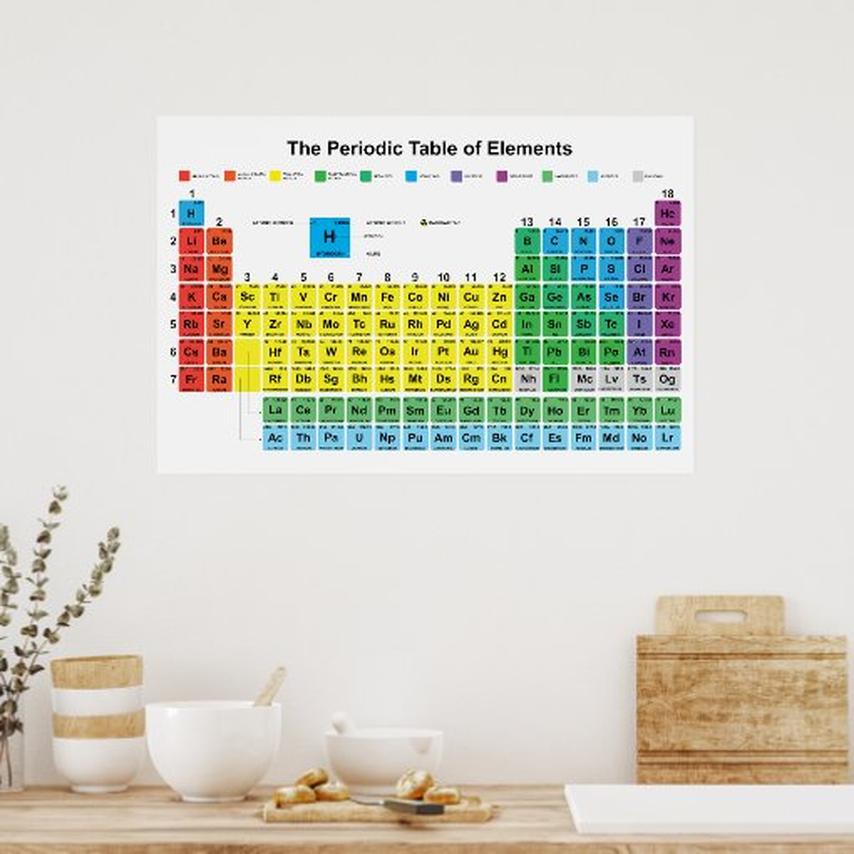
A Periodic Table of Elements Poster: Design, Features, and Reception
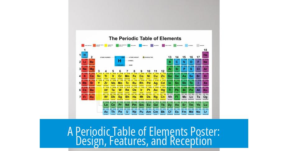
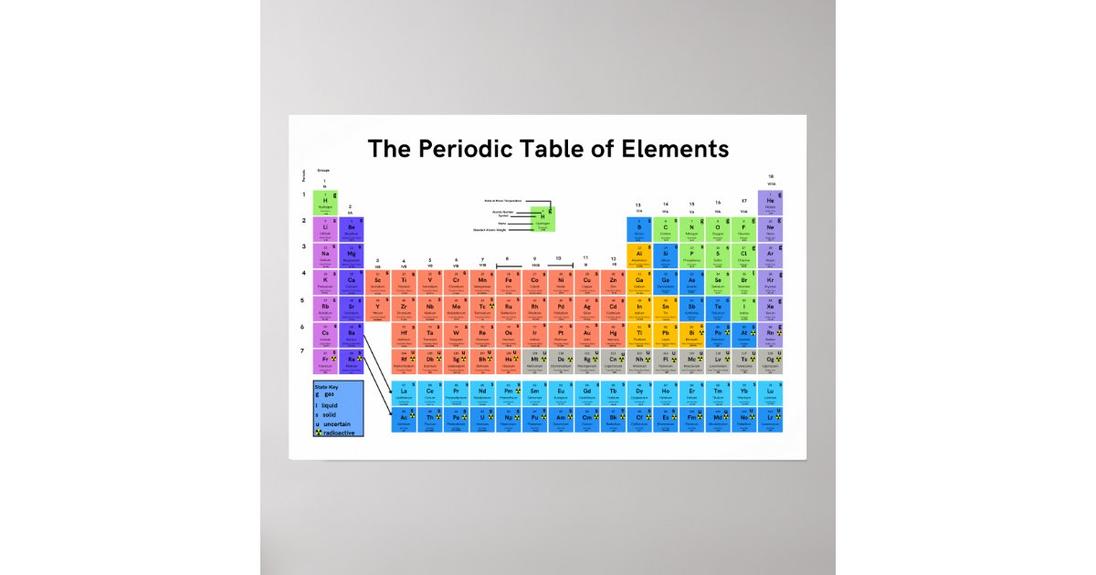
A periodic table of elements poster designed here stands out for its high visual quality, intricate detail, and educational depth. The design impresses with clarity and innovation, notably integrating crystal structures of each element. This approach transforms the traditional table into an engaging, comprehensive reference. The poster’s reception among chemistry enthusiasts and educators highlights its appeal and utility. Below is a detailed breakdown of this poster’s visual design, informational content, features, errors, and public feedback.
Visual and Design Quality
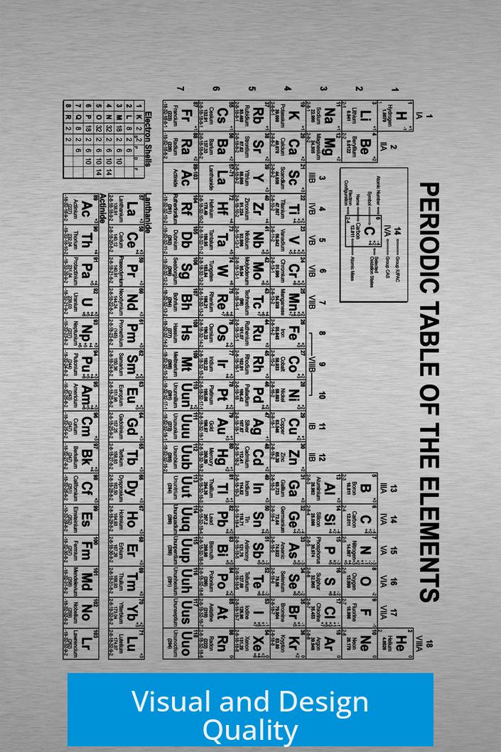
- The poster boasts a high resolution that preserves sharpness even at large sizes.
- Crystal structures for every element appear beneath the symbol, enriching the visual experience.
- The layout is described as resembling a “cathedral ceiling,” giving the chemistry reference a majestic and spacious look.
- Viewers consistently praise its aesthetic appeal, calling it “beautiful,” “stunning,” and “very pretty.”
- Many commend the effort visible in the artwork, appreciating how design and functionality merge seamlessly.
- There are suggestions from users wanting versions as mousepads or full-desk covers to keep the information constantly accessible.
Informational Content and Complexity
The poster goes beyond a standard periodic table by including comprehensive data points for each element. These include physical properties, melting points, electronic configurations, and more.
Some users find the amount of information “informationally overwhelming.” The abundance of details may demand careful study rather than a quick glance. Despite that, many express eagerness to display it at full scale and study it for hours, indicating strong educational value.
- The design is rich with scientific data, aiming to satisfy both novices and experts.
- Its complexity encourages curiosity and deeper understanding of elemental properties and relationships.
- The extensive content may require gradual exploration, appealing to dedicated learners.
Specific Features Included
- Crystal structures illustrate the spatial arrangements of atoms in solid elements.
- Organic and inorganic compounds are presented alongside elements, revealing chemical behavior in common molecules.
- Electronic configurations are given using proper notation, though some errors exist (detailed below).
- Information on melting points, hardness, isotopes, and nuclear data enhances the poster’s scope.
- User questions indicate curiosity about selection criteria for included compounds, specifically which inorganic and organic molecules were chosen.
Errors and Typos Noticed
Despite its detailed design, some mistakes appeared in the initial version. These include:
- Incorrect melting point of lithium in Fahrenheit due to a misplaced negative sign.
- Duplicate element descriptions, such as samarium and europium sharing sodium’s text.
- Typographical error in noble gas electronic configuration (neon) notation.
- Naming confusion where neptunium and plutonium were labeled “neptune.”
- Mislabeling of some inorganic molecules like “Carbon Chloride” instead of “Carbon Tetrachloride.”
- Structural inaccuracies in representations of sugars and a misplaced atom model in the orbital section.
- Unclear Mohs hardness rating listed as zero for hydrogen, which contradicts standard scales.
An updated, error-corrected version with higher resolution is available for viewing and feedback via the official link provided by the designer. Community involvement is encouraged for ongoing refinement.
Suggestions and Ideas from the Community
- Expand on isotopic data to show natural abundances for elements.
- Clarify half-life information by specifying isotopes involved, aiding nuclear science accuracy.
- Consider producing a large puzzle format as an educational tool for students.
- Develop complementary posters—e.g., featuring asteroids’ composition and solar system positioning—to broaden scientific learning.
- Further improve interactivity by exposing detailed chemical reactions or material uses.
Experience and Reception
The poster receives remarkably positive feedback. Science teachers plan to show it to their students. Many viewers find it both a decorative and instructive piece.
- Users express awe at its detail, describing it as “marvelous” and “the best periodic chart” they have seen.
- Some refer to it as suitable for large wall displays where it can be studied at length.
- Comments like “I’m in love” and “nice job” emphasize emotional and intellectual appreciation.
Overall, it acts as a resource and an art piece, engaging both casual learners and experts.
Access to Updated Version
The designer provides a high-resolution, corrected version accessible at https://www.halcyonmaps.com/periodic-table-of-the-elements/. Contributors are invited to identify and report any remaining errors. This community approach supports ongoing accuracy and improvement.
Questions Raised
- How were the organic and inorganic compounds selected? There is particular interest in criteria behind molecule choices.
- Inquiries about certain unusual molecules, such as those containing nickel, carbon, potassium, and erbium, indicate curiosity about complex inclusions.
Key Takeaways
- The poster combines aesthetics with scientific detail, providing a rich reference for chemistry enthusiasts.
- Crystal structures and molecular examples add unique educational content beyond standard tables.
- Information density invites focused study but may appear overwhelming initially.
- Known errors have been addressed in a newer version, open for community review.
- Viewer feedback demonstrates strong positive reception and suggestions for expanded educational materials.
- Link provided for accessing the updated poster and participating in its refinement process.
A Periodic Table of Elements Poster I Designed: A Visual Feast and a Knowledge Powerhouse
If you ever wondered what happens when art meets science head-on, the periodic table of elements poster I designed is the answer. This project isn’t just a wall decoration; it’s a visually stunning and information-packed ode to chemistry. From crystal structures to organic and inorganic compounds, every pixel tells a story.
So, what makes this poster stand out in the crowded realm of periodic tables? Let’s dive deep into its design, depth, quirks, and the genuine reaction it sparks.
The Artistry That Speaks Volumes
First impression: it looks 🔥 cool. Seriously, the design quality is breathtaking. This isn’t your average blocky, bland periodic chart. Instead, the high-resolution format offers sharp visuals, allowing every element to shine – literally! The inclusion of each element’s crystal structure? Brilliant move. Imagine glancing at the poster and instantly grasping how metals, gases, and nonmetals arrange themselves in 3D. That’s not just info; it’s visual storytelling made real.
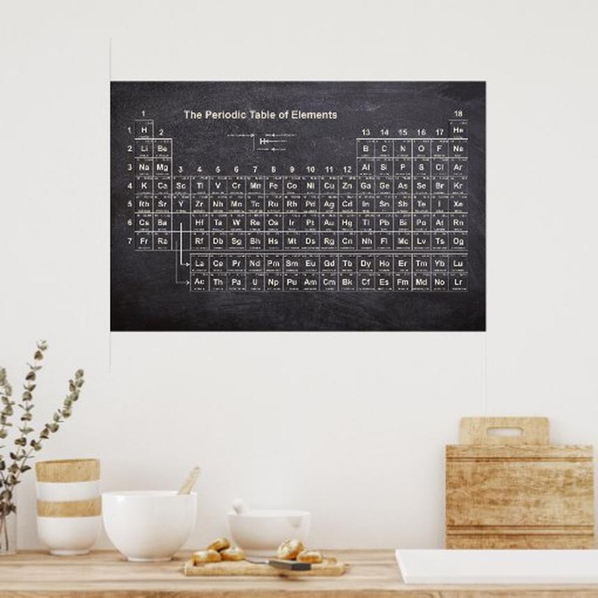
Fans have even wished this beauty could be a mousepad or cover their entire desks—talk about making chemistry part of daily life! The format draws inspiration from cathedral ceilings, giving it an expansive and awe-inspiring feel. Perfect for a classroom or the home office.
Information Overload? Yes, But In a Good Way
Admittedly, the poster is densely packed. Some call it “informationally overwhelming,” and that’s fair. We’re talking about hundreds of details, including electron configurations, melting points, and crystalline arrangements—all on one canvas.
Yet, here’s the kicker: people love to stare at it for hours. There’s something riveting about unraveling the complexity of nature’s building blocks when it’s presented so elegantly. It’s like turning the periodic table into a puzzle waiting to be solved by curious minds.
One might ask, “Isn’t it too busy?” Perhaps, but in a way that invites curiosity rather than confusion. For chemistry buffs or students eager to learn, this poster is a goldmine.
Adding Depth: Organic and Inorganic Compounds Included
What about those intriguing additions—the organic and inorganic compounds? Yes, I used molview to generate accurate molecular structures, selecting the ones that are most common and representative. Why? Because elements seldom act alone in real life.
This layer elevates the periodic table from a simple reference to a mini-chemistry workshop. The compounds help illustrate how elements combine in the real world, especially in everyday substances. It sparked questions too: Were these compounds randomly picked? No, they were curated thoughtfully. For example, carbon tetrachloride replaces any incorrect label like “carbon chloride,” fixing previous typos. This attention to detail ensures educational accuracy.
Typos and Errors: A Work in Progress
In the spirit of transparency, the initial version had some errors—typos on melting points, copy-paste mix-ups like Samarium sharing Sodium’s description, and misplaced hydrogen models. Even the electronic configuration of Neon had a slip (should be [He] 2s2 2p6, not quite as before).
But fear not! An updated, higher-resolution version with corrections is live at Halcyon Maps. The community is encouraged to spot remaining typos. Think of it as a collaborative chemistry treasure hunt!
Engaging With the Science Community
This poster isn’t just for the casual observer; it’s a conversation starter for educators and scientists alike. Teachers see its potential to make lessons more immersive. Some envision blowing it up to wall size for classrooms. Others dream about a 1000-piece puzzle variant, creating a tactile, fun way to learn elements.
Questions arose, such as “Why is hydrogen’s Mohs hardness 0?” or the origin of certain molecule choices. These inquiries highlight the intriguing challenge of balancing visual beauty with scientific precision. It’s a reminder that science is always evolving, and art must keep pace.
Why Does This Poster Matter?
- It’s visually engaging. The stunning high-resolution graphics pull viewers in and keep their attention.
- It’s educational and detailed. From crystal structures to organic molecules, you get more than just element names and numbers.
- Errors are honestly handled. Acknowledging and fixing mistakes shows dedication to quality.
- It encourages exploration. Viewers are invited to analyze, question, and even contribute errata.
What Could Be Next?
Imagine expanding this concept beyond elements. One user suggested incorporating asteroids from our solar system with details on their shape, makeup, and distance from Earth—especially those featured in popular media like The Expanse. That adds an astronomical twist to the periodic table vibe.
Or consider tying isotopes’ half-lives more clearly to specific isotopes to appease nuclear physicists. The potential for growth is enormous.
Final Thoughts
Designing this periodic table poster has been a journey of passion and precision. It blends science and art seamlessly. While not perfect, it’s a spectacular tool for sparking curiosity and learning. It proves that even the most complex scientific data, when presented with care and creativity, can become an inspiring work of art.
Ready to see it in all its glory? Check out the updated version, hunt down typos, and maybe even buy a giant print for your wall. Who said chemistry can’t be beautiful?
After all, if elements come together in such intricate harmony, why can’t your walls?
What makes your periodic table poster different from others?
It includes crystal structures for each element. The detail level is higher with organic and inorganic compounds shown. The resolution is very good, making it visually striking and educational.
How did you select the organic and inorganic compounds displayed?
The compounds represent common examples linked to various elements. The choice aims to highlight typical uses or forms, but it’s not exhaustive. The poster’s complexity shows careful selection.
Are there any mistakes in the poster I should be aware of?
Yes, some typos and errors were found. For example, lithium’s melting point and descriptions for samarium and europium. An updated, corrected high-resolution version is available online.
Can this poster be used as an educational tool despite its complexity?
Yes, though it is detailed and can feel overwhelming. Many find it useful for studying or display. Its rich information supports extended exploration of chemistry.
Is there a larger or interactive version of this poster available?
Yes, a high-resolution, fixed-error version is on the creator’s website. It offers better clarity and allows viewers to spot details or typos through zooming.
Have you considered turning this design into other formats or products?
Ideas include puzzles for education or themed mouse pads. Expanding into different media could help learners engage differently with the elements and their properties.

Leave a Comment